Formatting Content in Carrd for Clarity & Impact
Introduction: Design is Half the Battle—Content is the Other Half
Even the most beautiful Carrd site falls flat if the content feels clunky or poorly structured. In this guide, we’ll teach you how to write, format, and structure content that flows naturally and keeps users engaged, using Carrd’s built-in tools and some clever markdown tricks.
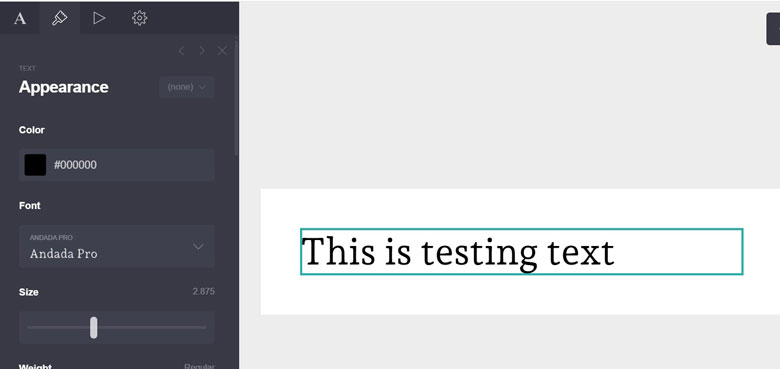
1. Basic Text Formatting: Start With the Fundamentals
Carrd’s text editor allows for bold, italic, and paragraph breaks—use them wisely:
- Bold to emphasize key takeaways
- Italic for subtle emphasis or voice
- Use short paragraphs (1–3 sentences) for better readability
- Avoid wall-of-text syndrome—use whitespace as a tool

Pro Tip: Add intentional line breaks to guide the reader’s eyes down the page.
2. Advanced Markdown: Unlock Hidden Formatting Powers
Carrd supports basic Markdown, allowing for quick formatting:
**bold**,*italic*,~~strikethrough~~- Use
#or##for heading hierarchy inside text blocks - You can nest lists and even create inline code snippets with backticks
Pro Tip: Use > blockquotes for testimonials, quotes, or callout boxes.
3. Highlighting: Focus the Reader’s Attention
Use Carrd’s “highlight” feature to call out key phrases:
- Great for call-to-action text, features, or warnings
- Keep it consistent (use the same color scheme sitewide)
- Don’t overuse—highlight sparingly for real impact
Pro Tip: Use highlight colors that contrast but complement your palette.
4. Links That Drive Action
Embedded links are key to converting visitors or guiding them deeper into your funnel:
- Use descriptive anchor text: e.g., “View Pricing Plans” vs “Click Here”
- Open external links in a new tab (check the box)
- Use buttons for primary actions and inline links for secondary ones
Pro Tip: For internal linking, use anchors with IDs like #contact to jump within your page.
5. Lists, Blockquotes, & Visual Breaks
Organize info into easy-to-scan chunks:
- Bullet points work best for features, FAQs, or benefits
- Numbered lists work well for step-by-step tutorials
- Blockquotes create natural visual breaks and emphasize storytelling
Pro Tip: Alternate paragraph sections with list blocks for visual rhythm.
6. Formatting for Mobile: Test Everything
Text that looks clean on desktop can turn chaotic on mobile.
- Keep line length short (aim for 40–60 characters per line)
- Avoid long headers or one-line lists that overflow
- Always preview your formatting on mobile mode in Carrd
Pro Tip: Add custom mobile-only blocks when you need a better user flow on small screens.
7. Formatting Based on Content Type
Different pages = different formatting styles:
| Page Type | Best Practice |
|---|---|
| About Page | Use short narrative paragraphs and quotes |
| Services Page | Bullet points with short descriptors |
| Product Page | Feature lists, CTA buttons, and minimal fluff |
| Landing Page | Headline → benefits → testimonials → CTA |
Pro Tip: Each section should support a single, clear goal—format accordingly.
Conclusion: Let Your Content Do the Talking
A great Carrd site doesn’t just look good—it communicates clearly and efficiently. With these formatting techniques, your content will flow beautifully across devices and guide users exactly where you want them to go.