Mastering Carrd Appearance Settings for Professional Design
Introduction: Make Your Carrd Site Look Like It Was Built by a Pro
Carrd gives you all the tools you need to make a clean, modern site—but without guidance, many people settle for something basic. This guide walks you through advanced appearance settings that elevate your Carrd site from "just okay" to “Web 2.0 worthy.”
1. Carrd’s Design Philosophy: Clean, Simple, and Fast
Carrd’s minimal interface encourages simplicity—but that doesn’t mean boring. With thoughtful tweaks to spacing, hierarchy, and visual elements, you can create sites that are lightweight and polished.
- Use minimalism to your advantage
- Prioritize clarity over complexity
- Design for mobile first, then scale up
2. Professional Color Schemes: Go Beyond the Defaults
Colors make or break a website’s aesthetic. Instead of relying on Carrd’s defaults, create a custom palette using:
- Coolors.co or Adobe Color
- 60/30/10 color rule for visual balance
- Soft background colors + high-contrast CTAs
- Avoid jarring neons or oversaturated hues unless on-brand

Pro Tip: Use semi-transparent overlays to make images and text work together.
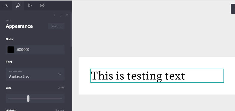
3. Typography That Looks Designed (Not Default)
Fonts are your voice. Carrd supports Google Fonts, so you can customize tone and clarity easily.
- Pair one serif and one sans-serif for contrast
- Use font weights (400/700) to create hierarchy
- Set line height (1.4–1.6) for readability
- Use caps sparingly—consider hierarchy via size and boldness instead
Pro Tip: Use different font sizes for desktop and mobile for optimal readability.
4. Layouts with Containers, Margins & Padding
Carrd’s container elements let you build modular layouts that feel structured and intentional.
- Use vertical padding consistently between sections
- Apply horizontal padding to keep content readable
- Nest containers for layered design effects
- Align content (centered or justified) based on section purpose
Pro Tip: Limit full-width text blocks. Use columns or visual breaks for flow.
5. Button & Link Styling That Converts
Carrd lets you fully style buttons—make them count.
- Use contrasting button colors (CTA should pop)
- Rounded corners = softer, more modern feel
- Consistent sizing and spacing for predictability
- Add hover effects for interactivity
Pro Tip: Make your primary CTA button bigger than the rest—yes, really.
6. Responsive Design Considerations
Carrd auto-adjusts for mobile, but here’s how to make it smoother:
- Avoid oversized headings on mobile
- Test containers on various screen sizes
- Set mobile-specific padding/margin settings
- Use vertical stacking instead of side-by-side layouts
Pro Tip: Test responsiveness by dragging your browser window to see live changes.
7. Build a Reusable Design System in Carrd
Want to build multiple sites or landing pages fast? Use Carrd’s duplication feature + shared design elements to:
- Create a brand style guide (fonts, buttons, containers)
- Reuse layout templates with different content
- Maintain visual consistency across all pages
Conclusion: Unlock Carrd’s Visual Power
When you master appearance settings, Carrd becomes more than a simple builder—it becomes your visual toolkit. Bookmark this guide, refer back to it, and take the time to craft a site that feels custom, confident, and clean.