Adding Web 2.0 Motion to Carrd with Animation Features
Introduction: Subtle Motion = Modern, Memorable
Animations can make a Carrd site feel dynamic and polished—but only if used intentionally. Done right, they guide the user, build flow, and add delight. Done wrong, they feel distracting or clunky. This guide shows how to add pro-level motion that feels like Web 2.0, not MySpace 2006.
1. Why Animation Matters in Modern Web Design
Motion builds anticipation, highlights interactions, and provides visual feedback. It helps:
- Create first impressions with smooth entrances
- Direct attention to key elements
- Make the site feel alive and responsive
- Establish a more premium, high-production feel

Pro Tip: Motion should support the content, not compete with it.
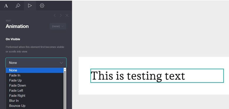
2. Entry Animations: First Impressions Matter
Carrd allows animations to trigger when elements load into view. Use these sparingly to introduce sections:
- Fade in for hero text
- Slide up for CTAs
- Zoom or scale in for product visuals
- Combine with delays for a staggered effect
Pro Tip: Avoid animating everything—use motion to pace your content, not overload it.
3. Hover Animations: Make Elements Feel Interactive
Give buttons, links, and cards a little life on hover:
- Grow/shrink scale (scale to 1.05 or 0.95)
- Color shift on hover (e.g., button background)
- Text underline or glow
- Drop shadow or lift effect
Pro Tip: Hover cues signal interactivity—great for conversions.
4. Scroll-Based Animations: Guide the Flow
With scroll-triggered effects, content can animate as it enters the viewport:
- Fade in rows of icons one by one
- Reveal testimonials or images in sequence
- Use delays to create rhythm
Pro Tip: Carrd doesn’t support full parallax, but staggered reveals can create similar engagement.
5. Performance & Accessibility Considerations
Animations should enhance—not hinder—site performance:
- Keep animation durations under 600ms
- Use easing functions (
ease,ease-out) for natural feel - Minimize motion for users who prefer reduced motion
- Test animations on mobile for lag or misalignment
Pro Tip: If your site feels “laggy,” too many animated elements may be the cause.
6. Common Mistakes to Avoid
 Too much animation = cognitive overload
 Animations with no purpose = wasted bandwidth
 Fast, jarring movement = unpleasant UX
 Animating essential content too late = delays in comprehension
7. Advanced Techniques for Pro-Level Motion
While Carrd’s native animation settings are basic, you can get creative:
- Use transparent overlays that animate separately
- Layer image + text blocks with different delays
- Combine animation with color shifts or blur
- Build one-pagers that animate section-by-section as you scroll
Pro Tip: Combine animations with content reveals to control story pacing like a landing page funnel.
Conclusion: Make Carrd Feel Like It Was Coded From Scratch
Animations give your Carrd site personality and professionalism—when used with care. Start small, test often, and remember: great motion is felt more than seen.